Science Fiction & Fantasy Illustrations
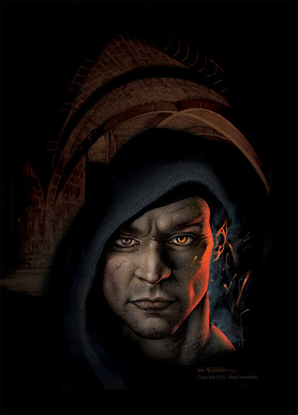
“In my opinion there are too many apocalyptic themes which dominate contemporary Science Fiction and Fantasy. I like to convey a sense of hope for the future, of wonder and the possibility of adventure and life — not only in worlds of the past but worlds of the future. When I am working on a painting I feel the same kind of enthusiasm I had when I was a kid out building a treehouse or playing with my friends. It is a feeling like no other, and I try to capture this in my work. I attempt to create images that breathe with life, vigor and energy, and that show the beauty and majesty of our natural environment." — Brad Fraunfelter























![]()
![]()
Brad's illustrations and photography can be seen on book jacket covers and in magazines across North America. An avid hiker and photographer, Brad can often be found trekking up into the hills and gardens surrounding Los Angeles. With backpack and camera in hand he has photographed thousands of landscapes, and these photos often serve as a source of inspiration for many of his illustrations.
Brad Fraunfelter is a digital fine artist, illustrator and photographer based in Los Angeles, California
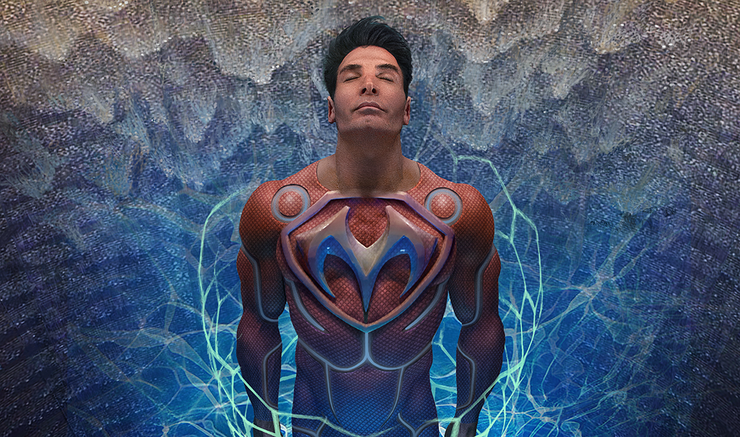
 SPIDERMAN
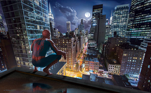
For many years one of Brad’s favorite comic book characters has been Spiderman, especially after seeing the 2002 movie starring Tobey Maguire. Brad says “I could really relate to the trials and tribulations that Peter Parker went through while he was growing up. I had a lot of the same things happen to me during my school years (except the spider super powers). Peter was also a photographer, which I thought was pretty cool!” In early 2017 Brad decided to do his own personal depiction of the famous superhero. Brad located an excellent body builder to do the modeling for the photoshoot. Brad photographed the model wearing a simple pair of black, speedo shorts. The model was lit with a harsh, blue gelled light to simulate moonlight, and with a red colored fill light to simulate the warm, incandescent light from the building behind the character. The skin tones were then carefully selected and colorized to produce the vivid red and blue portions of the costume. The silver, web pattern was carefully painted over the shoulders, arms and boots, paying careful attention to the curvature of the muscles. Brad also applied a very fine, scale-like pattern to the blue portions of the suit. Finally, the rooftop, and water puddles were painted by hand, and a rough, pebble texture was applied to the surface texture to the roof. The cityscape background was created through the aid of a photo of downtown Manhattan, which was digitally repainted and recolored.
 THE ZERO CURSE
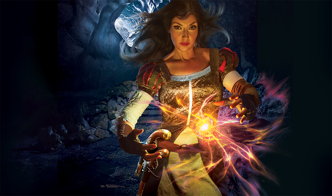
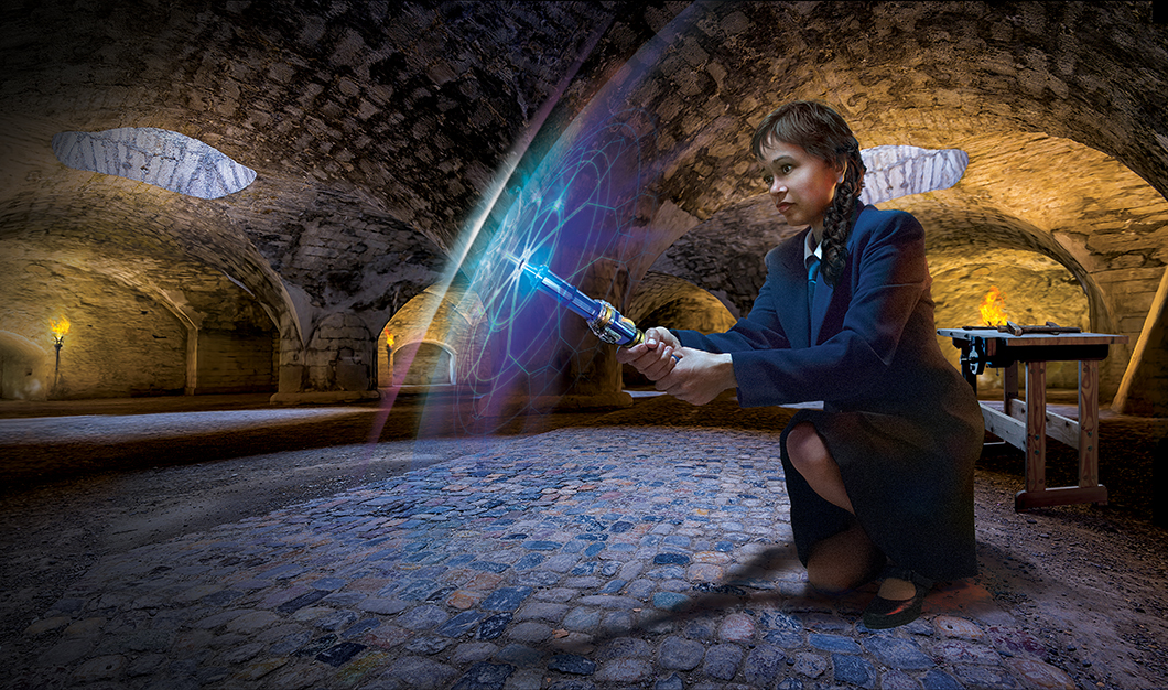
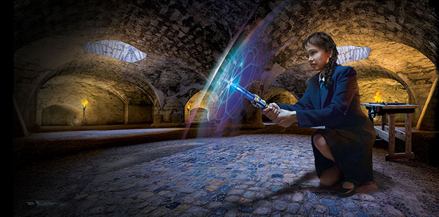
Early in 2017 Brad was commissioned by prolific author Christopher Nuttall to create the cover art for a series of fantasy novels called the "Zero Enigma" series, a story about a 12 year old girl who is sent to a Sorcery Academy to discover and develop her magical powers. Shortly after the first book was released Brad was asked to do the cover for the second novel, titled “The Zero Curse”. The cover art was to show the main character as she attempts to escape an invisible force field by use of a wand-like device that she has constructed. Brad’s wife served as the model for the main character. Brad photographed his wife using a harsh, blue top light to simulate the blue outdoor light filtering into the chamber from above, and a warm, amber gelled sidelight to simulate the torchlight of the dungeon. Then the face was carefully reconstructed to look like a very young, black girl. The lighting effect where the wand touches the force field was created by first drawing a flat pattern of concentric circles and lines radiating out from the center. This pattern then had extreme perspective applied to it in Photoshop, and was warped to give it a slightly rounded appearance, which visually defines the edge of the dome-like force field that surrounds her.
 WISDOM OF THE CHOSEN
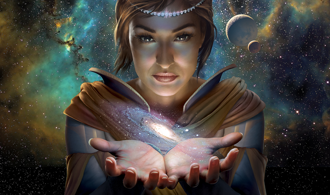
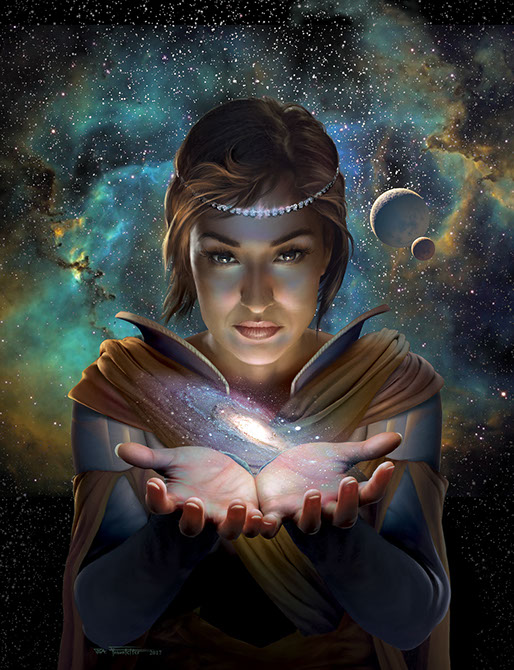
In May of 2017 Brad was contacted by the owner of "Creative Publishing Book Design” to do the cover art for an e-book. This was to be book number 5, and the last novel in a Sci-Fi series called “Spirit of Empire” by Lawrence P. White. The author wanted an upgrade to the look of his book series and the Designer chose Brad to do the cover for the final book. The concept was to show a woman cradling a galaxy suspended above her hands. Brad hired and photographed a model for the main character. The hands were photographed first, while Brad held a light bulb just above the model’s palms. The light bulb was wrapped with glue and red jells to add color to the light source. The face, and then parts of the costume were photographed separately using the same light source, and the individual elements were composited together in the computer. The background nebula, planets and stars were added in later. Finally some facial coloration, and costume details were painted in to complete the work.
 THE MARVELOUS MECHANICAL MAN
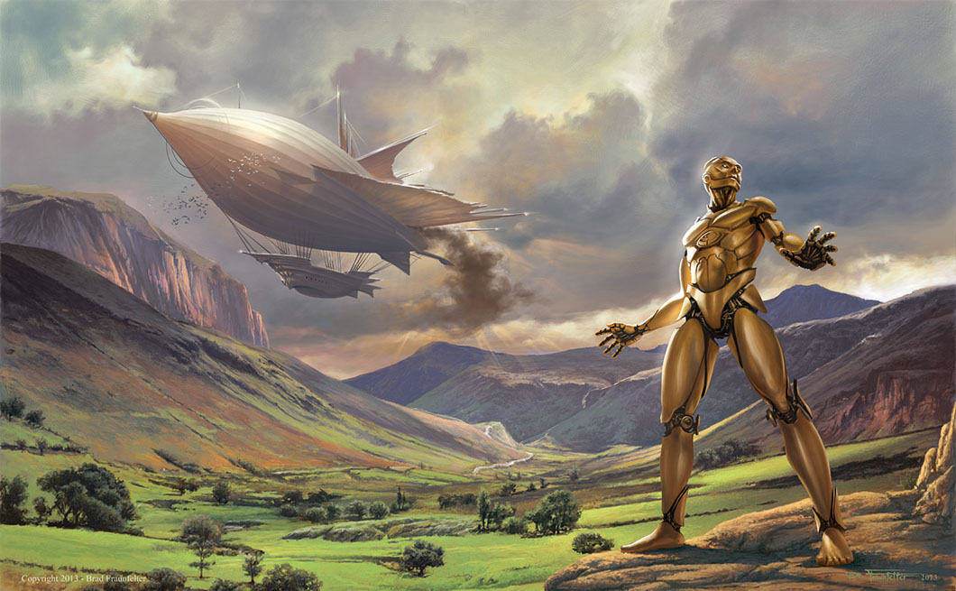
 This was a commissioned work by Zumaya Publications. This piece needed to be created in a new genre that I had not worked in before: “Steampunk” (a Science Fiction genre featuring steam-powered machinery and often set in the 18th or 19 century). The publisher informed me that the cover should look like an old-fashioned dime store novel called a “Penny Dreadful”. These booklets often had ornamental designs on the cover, so I decided to design a whole framework for the cover with gadgets and gears that would have windows in it to show the characters of the book.
I did two complete paintings: one of the ornamental metallic frame, and the other an entire landscape scene which depicts an airship from the book and a 9 foot mechanical man.e robot. I then used the photo as a lighting reference and painted directly over it to create the robot. As I progressed, I split the body at the joints, and then painted mechanical parts into the vacant openings.
 KEEPERS OF THE DAWN
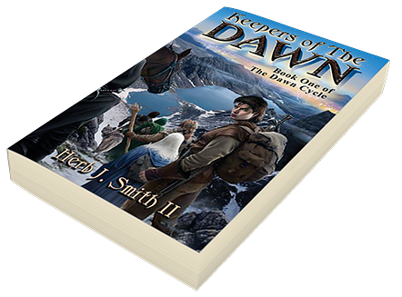
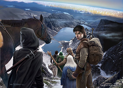
This is possibly the most complex cover I have done — there were five characters and two animals to be shown on the cover, and the author had painstakingly spelled out the exact details for each one. I turned to the Net and purchased a medieval type Robin Hood costume. Luckily Halloween was approaching and many costumes were available. My wife also picked up a cloak for me at a local costume shop. With these costumes and an Australian back pack I had gotten from an army surplus store, I posed and shot photos of myself for each of the six characters! I then heavily altered the photos in the computer and painted over them to create a distinctly different costume — and personality — for each character.
The barrier of light in the background was painted in as a last step to finish the piece. I created a mask with a smooth, curving arc by using the pen tool, converting the arc to a selection with a soft, feathered edge, and then brushing in the pale barrier of light.
 CHIMERA
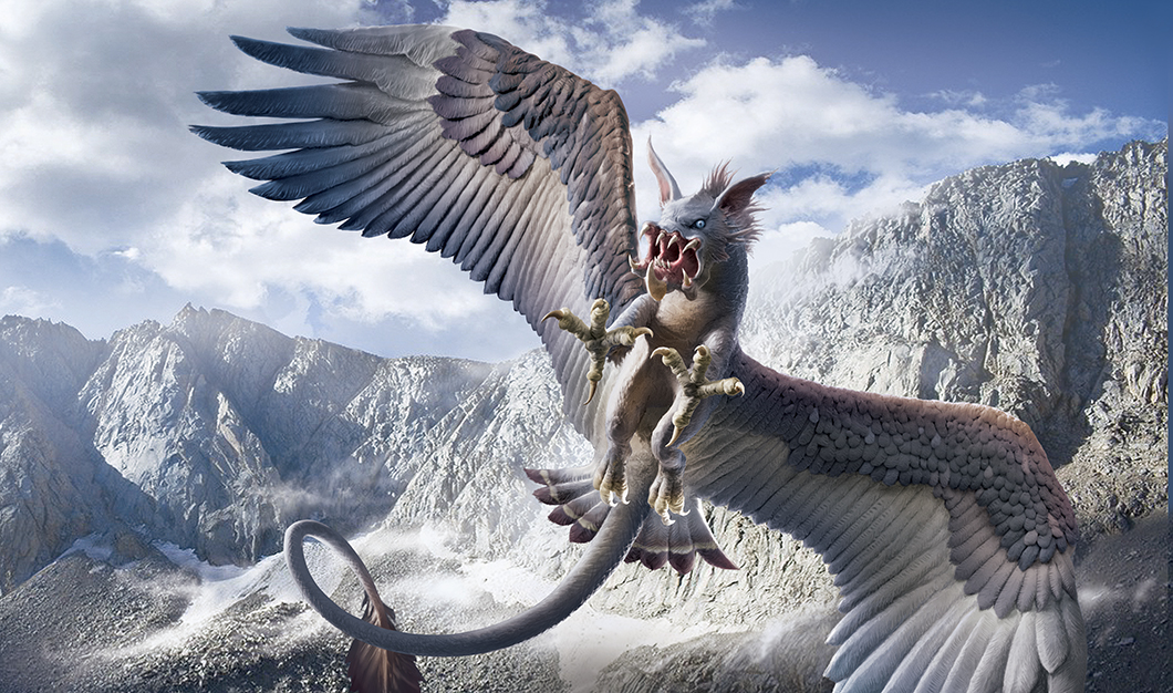
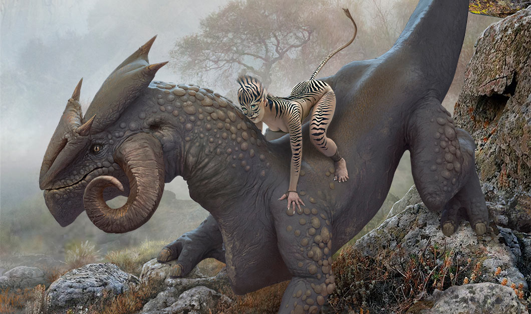
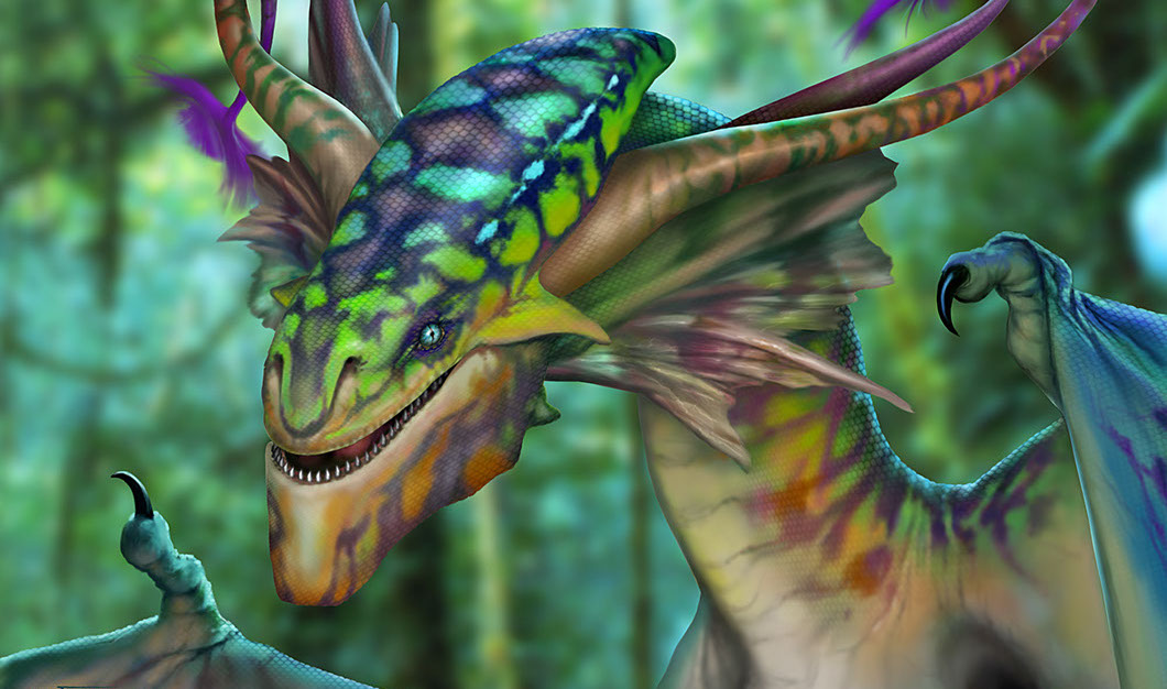
I wanted to create a dragon which had never been seen before. Something with brilliant, flamboyant color, and yet with intricate and realistic details. This was inspired in part by the movie Avatar which impressed me enormously. The work of Neville Page and other brilliant artists on the creature design inspired me to no end. I designed the head of the creature through a number of detailed pencil sketches, which I then scanned into the computer and used to paint over.
The coloration for the creature I took from nature itself. I used the striking colors of a Leopard Chameleon to paint the coloration on the head and neck of the creature. To add the scales on the head, I created a high contrast outline of a diamond pattern and overlaid it to the head. I then used the warping tools in Photoshop to warp the scale pattern and wrap it to the contours of the head. This was a very fun project, and took only a few days to complete. BUY PRINT
 FIREFLY
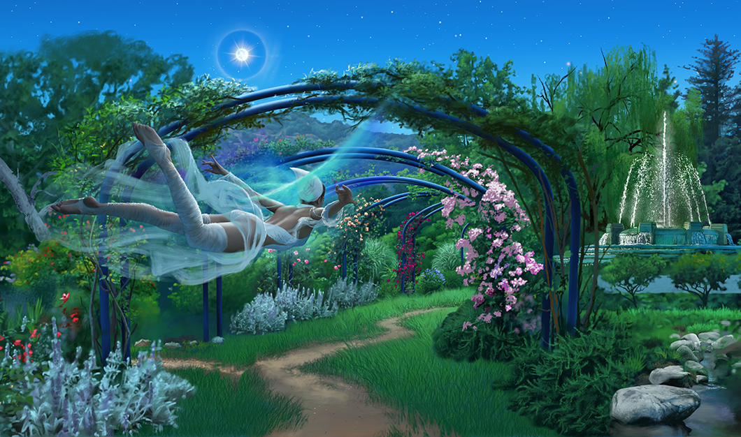
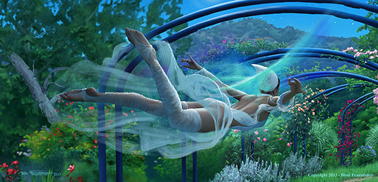
The inspiration for this work came out of the beauty of a botanical garden that I had photographed several years earlier. I was visiting Descanso Gardens in La Canada, California, and there was a beautiful rose garden and path with arches covered with roses of various colors. It was Spring and the roses were in full bloom. I took many photos, and the scene inspired me to paint an image of a fairy gliding through the archway at dusk.
I set up a lighting arrangement to simulate the soft lighting of an evening sky and photographed a model with her arms and legs outstretched as if she were flying. She was balanced at the midsection, on the seat of a swiveling chair, and I had an assistant rotate the chair at minute angles so that I could capture her in exactly the right angle. The dress and garments were painted in over the figure.
 INVIRAL
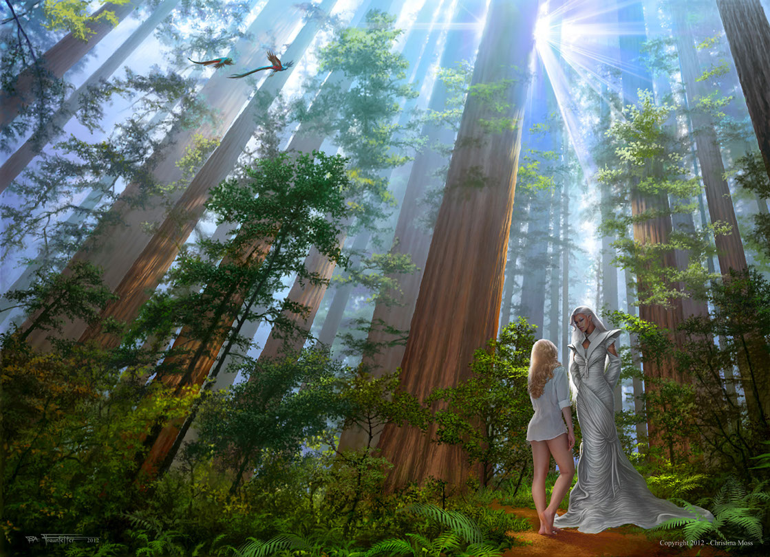
 This was the last in a series of 4 novels which I did for Adamantine Publishing, in Burbank, CA. The scene to be used from the book was one in which the main character (Julie) has a dream about being in a redwood forest with a tall, slender female of an alien race. I wanted to give the viewer the impression of standing in a forest, and being surrounded by towering trees, similar to being in a cathedral. The effects were achieved by careful use of color, light and perspective.
I first established a perspective grid to give the scene a sense of distance. I made sure that each tree followed these lines of perspective as it tapered toward the top of the image. I blocked in the color of the trees using the Gradient Tool in Photoshop, making the trees darker and richer at the bottom and lighter at the top. I then began painting in more and more detail. As a finishing touch I painted in random patches of sunlight hitting the trees at various places in the scene. This all by itself added an enormous amount of depth to the scene, very much to my surprise.
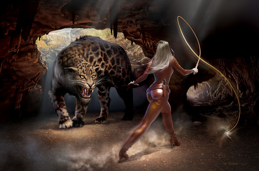
 PANTHERA
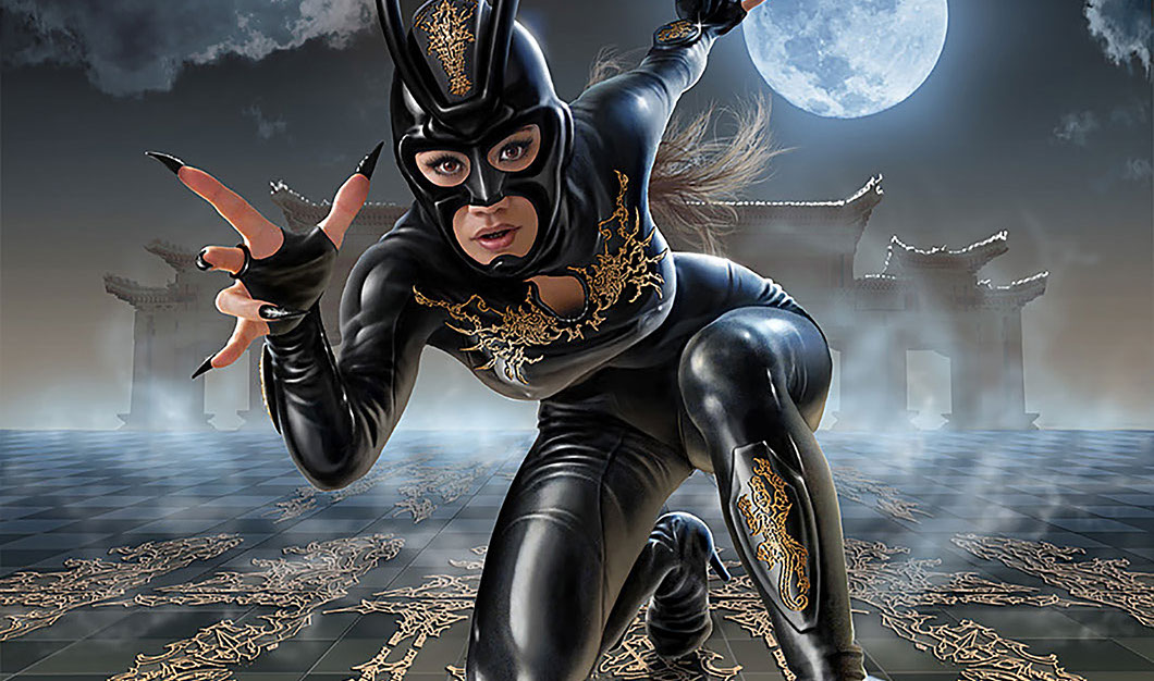
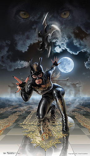
I wanted to create a seductive cat-woman type character, but something different than the usual black bodysuit and cat ears cliché. I decided to give the character an oriental flavor by creating a costume with an ornate gold inlay and a pronged headpiece reminiscent of helmets worn by ancient Samarai warriors.
A Philipino co-worker of mine posed for the photo shoot. She had a perfect physique for the character, but unfortunately the simple black leotard she wore completely absorbed the light and had no reflective properties whatsoever. All of the reflections had to be painted in by hand to create the shiny look of polished leather. I photographed the model at close range with a wide angle lens, to give a foreshortened effect to the character and to pull the viewer into the scene.
Using the Pen Tool in Photoshop, I designed a number of detailed patterns of tightly curving lines that were stylized with a lot of swoops and flourishes similar to the patterns in Chinese tapestries. I used an outline of a Panther as the central theme. This panther design carries throughout the costume, on the shin plates, floor and even down to the detail on the fingernails.
These patterns were then laid over the figure on a separate layer and warped to make them conform to the curves of the body. BUY PRINT
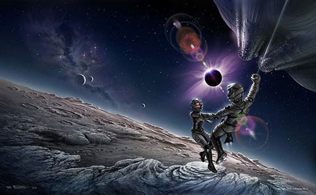 INSIGHT
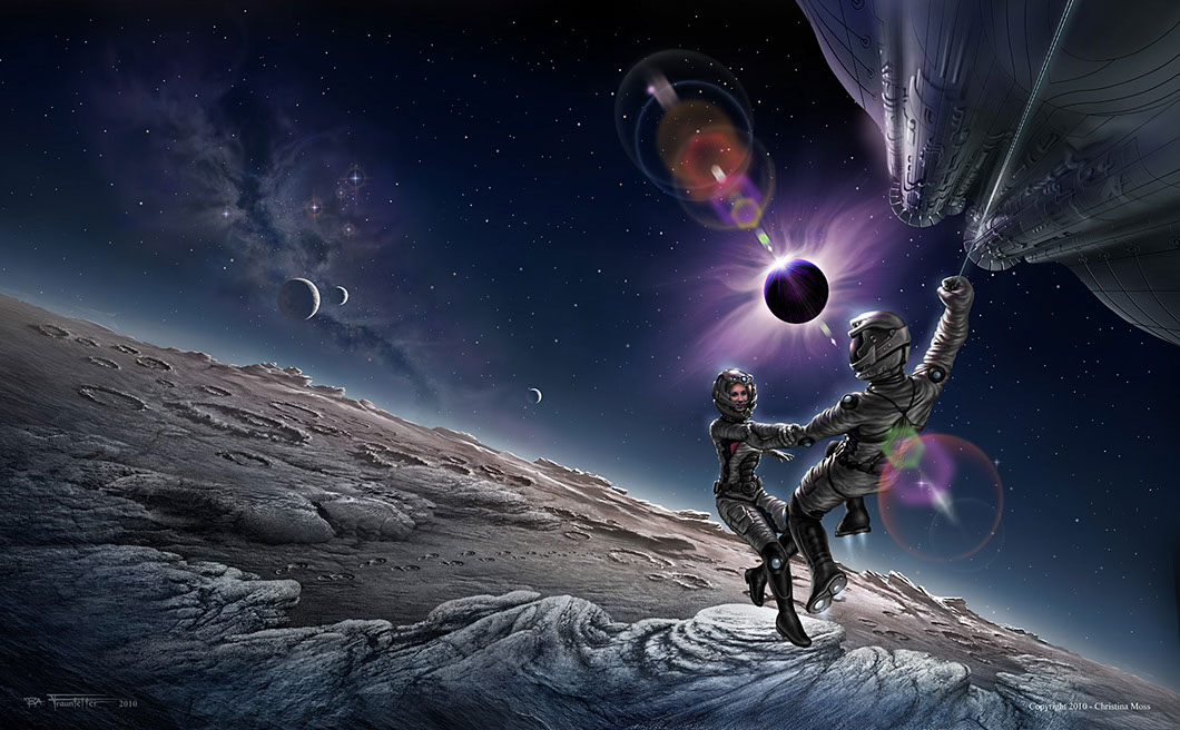
 One day, by lucky chance, I was at my chiropractor and was introduced to a book publisher who needed a cover artist. This was the first book cover I had done for a publishing firm and I was very excited at the prospect. The author of the book gave me a few descriptive scenes so I could work out a cover concept. The two main characters in the story would be descending through space toward the surface of a moon. While returning to their ship they would witness a solar eclipse.
I began the project by studying images of the moon, eclipses and paintings of astronauts by other artists. The spaceship, space suits, helmets, boots each had to be designed through a series of developmental sketches. I then did one overall sketch which composited all the elements together and finalized the composition. I scanned the sketch into the computer and this became my template for the painting. Using various reference images of rocks and lava flows I was able to gradually build up the moon's surface.
A co-worker and friend of mine modeled for the female astronaut's face. I set up the lighting to simulate an illuminated space helmet by placing a diffused lamp just above her head. To finish off the scene I hand painted in a series of lens flares surrounding the eclipse. Even though this was my first ever book cover, it was later recognized and featured in a 2-page spread in Advanced Photoshop Magazine.View Case Study
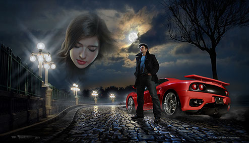 V
V AMPIRE OF MY DREAMS
This artwork is for the cover of a Vampire novel for Adamantine Publishing. I decided I wanted to get an ultra-realistic feel so I decided the best way to approach it would be to use a lot of photography: The man, the lighted bridge and the moon were all photos that I shot. The woman’s face, and the cobblestone street were stock images. One of my co-workers, also an actor, was the model for the main character. The lighting was set up in a studio environment, with a tall sidelight to simulate the glare of the moon on the side of his face, and a dimmer main light to approximate the diffused street lighting. The bridge was photographed near Pasadena, California, not far from where I live. After the photos were composited the entire image was blended together by painting in portions of the sky, the street, the bridge grating, the sidewalk and the fog.
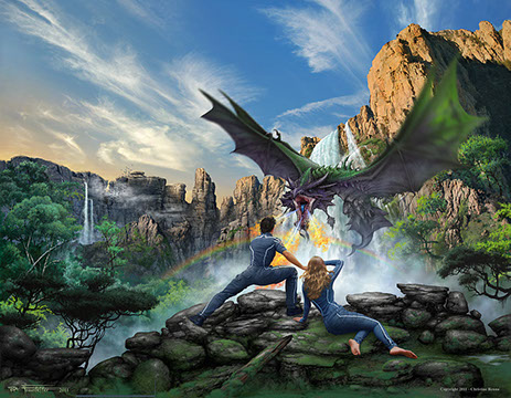 INCIRCLE
 After collaborating with the author and publisher, we decided upon a cover spread that would show a vast, panoramic jungle scene complete with a towering waterfall, cliffs, the Heroine, her partner and a fire-breathing creature called a Hydragon. The challenge was to put all of this together into one believable scene. The creature had some unusual characteristics, and it involved many design sketches of several creature types to come up with a satisfactory appearance.
Two models were photographed for the main characters: I set up a studio lighting arrangement that would simulate the lighting in the painted scene. The lamps were bounced off the ceiling to get a diffused effect similar to the shaded area beneath the falls. I did not have a male model available, so I photographed myself and then altered the photo to give it a more athletic physique.
Most of the background environment was painted using customized brushes in Photoshop, and this was composited with portions of photographs I had taken myself for the sky and the cliff wall. I had recently been to New Mexico with my wife and had photographed rock formations from the Sandia Heights tram ride. They came in very handy for constructing parts of the cliff wall.
KNIGHT OF FLAME
When I read the first few chapters of the author’s book the writing style captivated me. The author’s words were totally absorbing, and I knew this cover would be a very pleasant one to execute.
The main character (a knight who wields flame as his weapon) was described as having a rugged chiseled jaw, so I studied a number of faces of male actors including Daniel Craig and Jason Statham who have rugged jawlines that fit with the character.
Each letter of the word “FLAME” in the title was painted by hand using photos of flame as reference material. The dagger (shown on the back cover of the book) had its own design. I first sketched it out to design the look of the blade. Then I made a rough 3D model out of modeling clay. Next, I photographed the clay model, laying over a light table covered with 2X2 foot red filter to simulate the glowing hot iron of the anvil.BUY PRINT
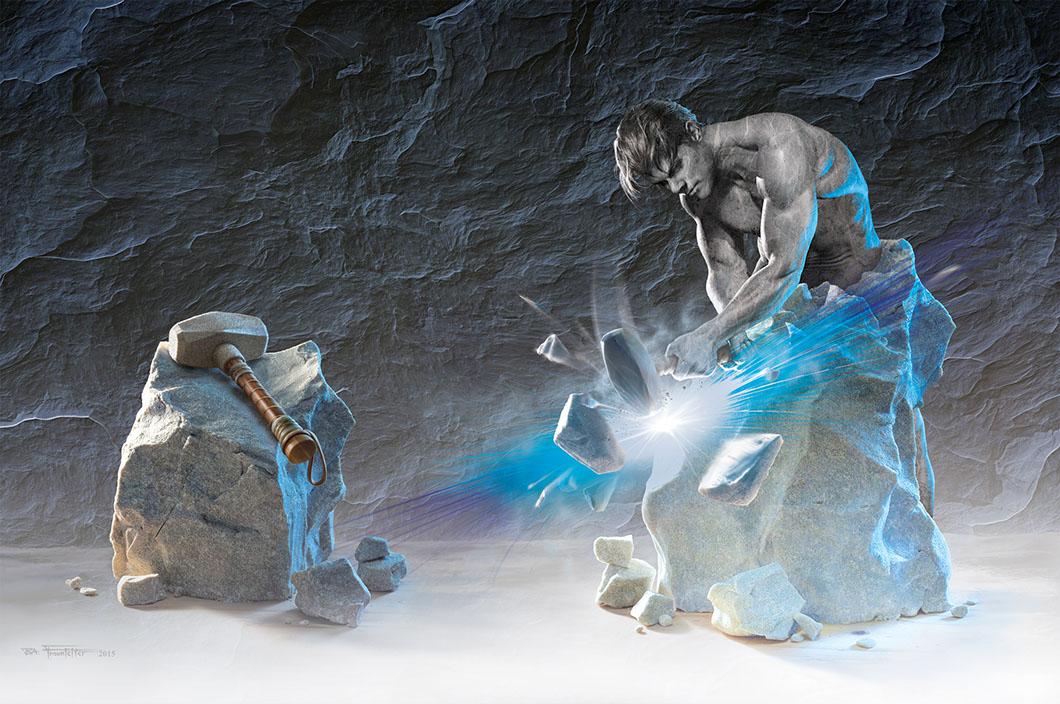
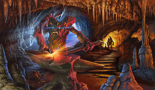 MAD MUNCLE'S FORGE
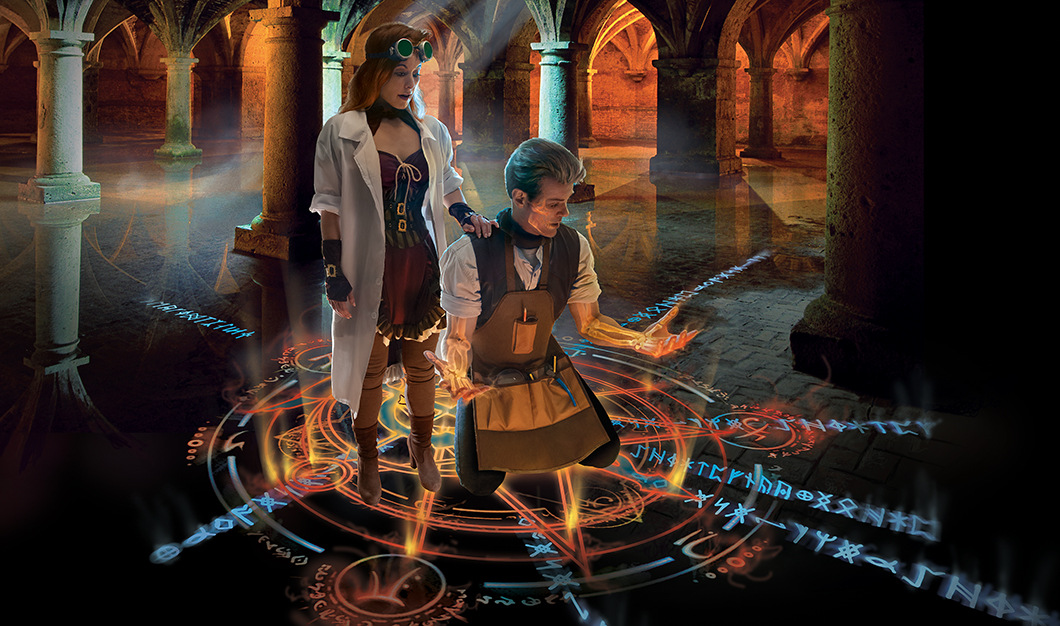
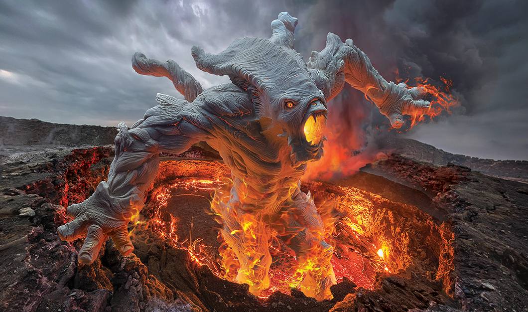
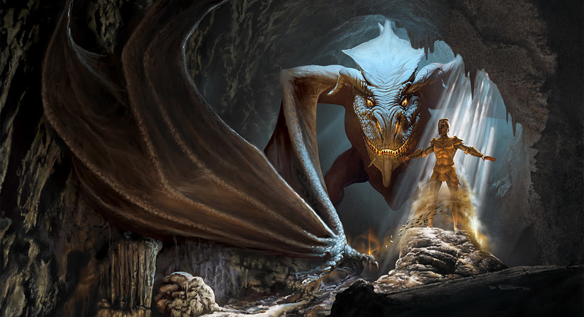
Scott Eder, author of one of the earlier books I had illustrated, asked if I would illustrate a character from his novel "Knight of Flame."
His plan is to use the artwork to assist with promoting the book and to create a banner for his website. The character is called a "Homunculus" or "Muncle" for short. They are dwarfs created out of rock by an alchemist.
The one shown in this illustration fashions weapons for the Elemental Knights, which are the main characters in a series of books about their duels on Earth with evil forces.
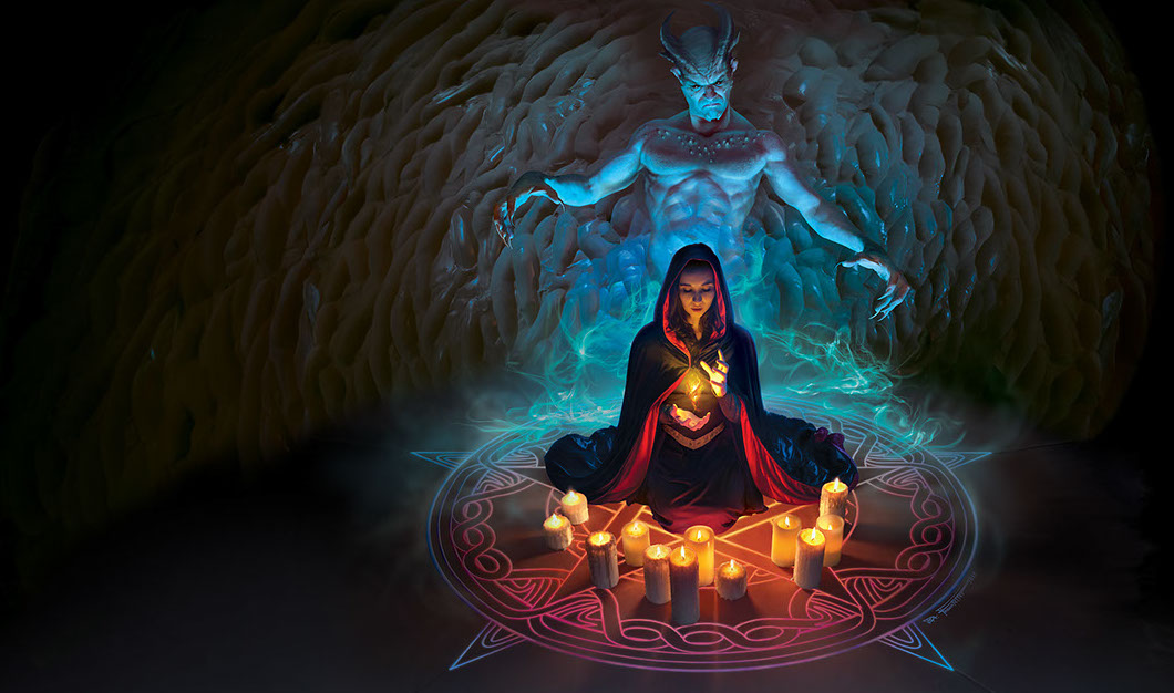
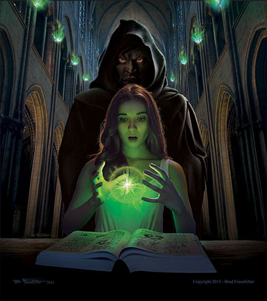 SCHOOLED IN MAGIC
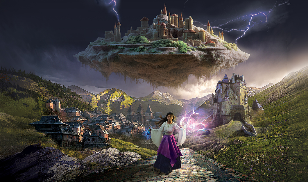
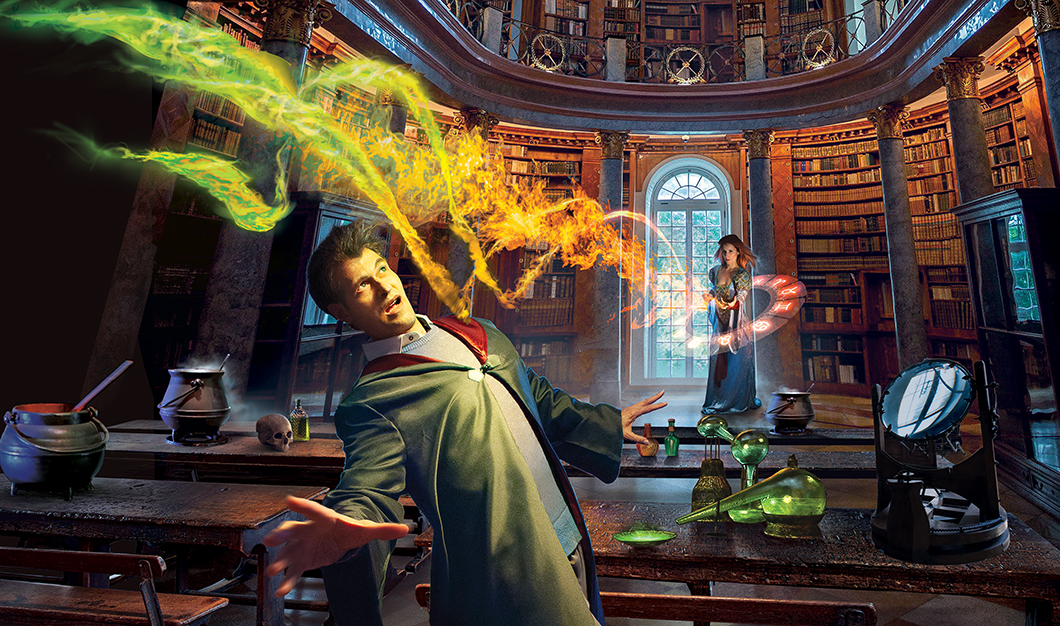
![]() This project was commissioned by Twilight Times Books and is one of my recent projects – just completed at the start of the New Year 2014.
This project was commissioned by Twilight Times Books and is one of my recent projects – just completed at the start of the New Year 2014.
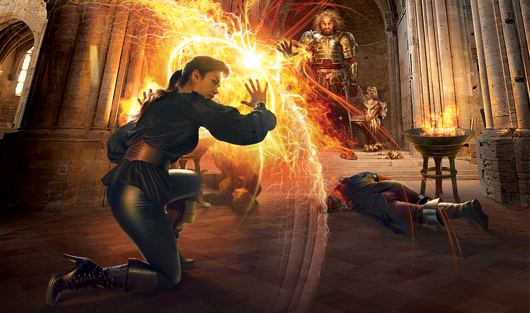
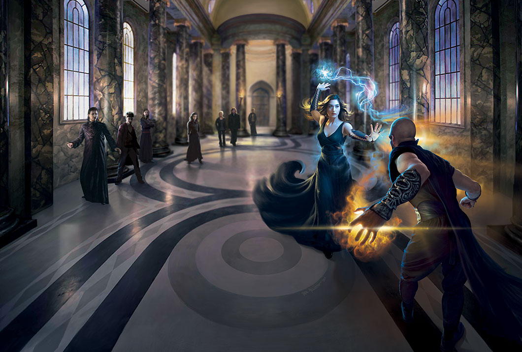
Liliah Richcreek, a talented actress in Los Angeles, modeled for it. For the photoshoot I placed a small household light bulb in front of her and wrapped it with green transparent filters to create the effect of the surreal magical glowing light. The photo of the model was then completely “painted” over using the smudge tool to give it a painterly effect. Most of the remaining illustration involved using Photoshop brushes – including the glowing ball of energy between her hands and the shadowy figure of the Necromancer behind her. The background cathedral was painted using a stock photo for reference.
 COLLISION EARTH
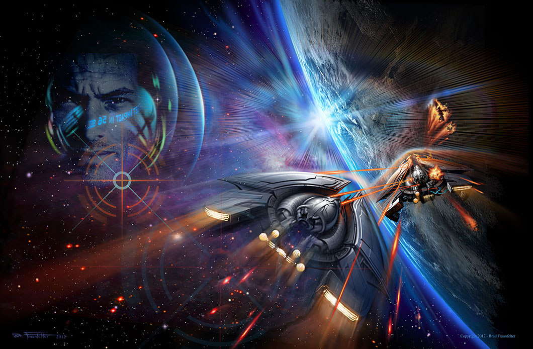
I wanted the focus of this piece on a feeling of great speed and used a lot of lighting effects and blurs to achieve this. The design of the ships was begun as a series of rough sketches, and then progressed by molding them in 3 dimensions with modeling clay. The clay model was then lit and photographed and the photographs of the models were placed into the scene. Surface detail, laser beams, etc. were then painted in layer by layer to finalize the design.
To give the effect of speed I selected and duplicated the rear, thrusters portion of the main ship and used the “Motion Blur” filter set at the same angle that the ship was traveling. I looked at NASA photos of re-entry burns and using a soft edged brush I painted in the appearance of heated vapors coming off the front of the foreground ship. I also used a soft edged selection and added yellow and red to the front edge of the ship to make it appear to be glowing hot.
The lens flair effect around the sun was done through a painstaking process of painting probably a hundred or so fine lines, one after the other, that were radiating out from a central point. I then erased away the central area leaving a circular ring of lines. The ring then warped to shape it into oval, and rainbow-like color was added to the edge of the ring. Finally I duplicated it to get the look of a multiple lens flare.BUY PRINT
Copyright © 2000 - 2023 Brad Fraunfelter except where noted for purchased artwork. Re-use of artwork displayed on this site for any purpose is prohibited unless permission is granted in writing by the artist and/or copyright holder. Please contact 323.240.5744 or use our contact form to request permission, purchase or to license artwork. Site design and maintenance by www.DesignStrategies.com.

