Science Fiction & Fantasy Illustrations
PAGE 2
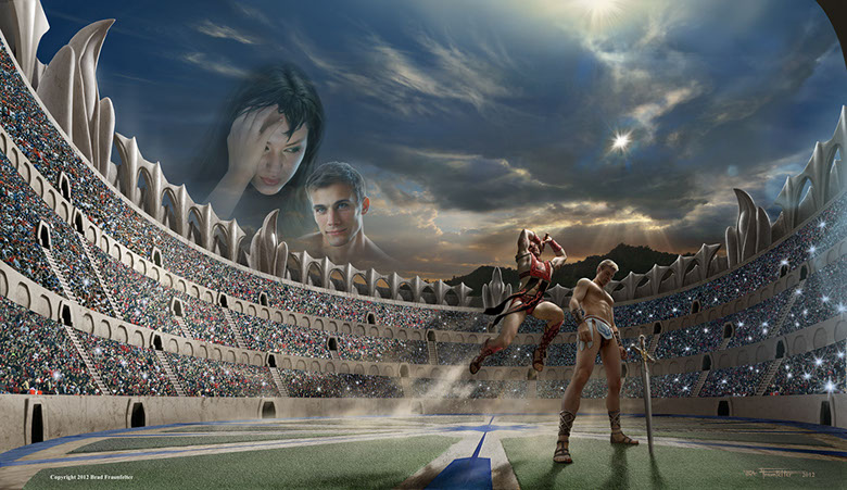 CONQUEST EARTH
A friend was writing a series of novels and described to me a cover illustration scene of a gladiatorial battle in which two characters would be engaged in a fight to the death. I decided to give the piece a starkly realistic appearance rather than a painterly, artistic look. To get this effect I decided to “build” the scene using quite a lot of composited photos – from both my own photoshoots, and through a number of purchased stock images.
One of my co-workers had a muscular build and modeled for the “Red Dragon” fighter, while I used a more than heavily doctored photo of myself for the blond foreground character. When lighting the figures I used bare photo-flood bulbs to create the effect of glaring, harsh sunlight.
To create a realistic looking arena setting I needed to understand its architecture, so I spent a good bit of time studying the structure of the ancient Coliseum in Rome. I decided to give the arena a hexagonal structure, with flat sides and at each corner to have some type of pillar extending up into space. I sculpted in clay a "falcon" shape to use as the corner piece for my coliseum. I then photographed it at varying angles and placed them in the image at various points around the top edge of the coliseum. BUY PRINT
 FORBIDDEN VALLEY
One morning, in mid-winter I was walking to work and I noticed the snow-capped Verdugo Mountains in the distance. It is rare to see snow in Los Angeles, even in winter, and it captured my attention. A scene flashed to mind of a vast, snowy landscape across which a Viking warrior was passing on a dog sled. I decided the concept would make an interesting painting.
I wanted the image to be stark and realistic, so I paid great attention to detail. The painting took about 2 months to complete. I took several shirtless photos of myself in the battle stance of a warrior and used these to help create the Viking. I used the liquefy filter in Photoshop to bulge out the muscles and beef up the physique.
Using references of snow-capped mountain peaks, I painted in painstaking detail the distant mountains. Images of dog sled races gave me the look I needed to create thick furred dogs heaving against the weight of the warrior's sleigh.
I wanted the environment to have a menacing look — as if the warrior was passing through forbidden territory — so I designed the dragon and give it a jagged back with long spikes. I gave it a dark, smoky hide to stand out in contrast to the whiteness of the snow. I designed the castle to have a similarly jagged and forbidding look. BUY PRINT
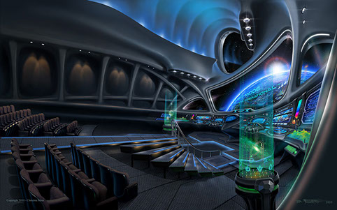 INTWINE
I had never designed the interior of a spacecraft before (who has?) so this was one of the most challenging projects I'd been offered to that time, and honestly I didn't have a clue how to approach it. The author wanted to show the interior of a spaceship complete with knobs, buttons, controls, dials, etc. in what could be a believable layout for controlling such advanced technology.
I started by sketching some crude, wide-angle scenes of the interior of the ship. Then I blocked in the detail of the structural skeleton, leaving blank spots for each display screen. I realized that to have realism I would need to design each of the multitude of display screens on the console. Each one of the screens was separately designed and painted as its own mini canvas, and then each was cut and pasted within the blank windows of the console and then distorted to give it the correct perspective.
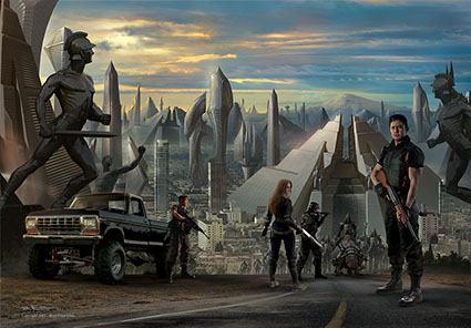
 WINDMILLS
 This work was commissioned by Zumaya Publishing. The story had a post-apocalyptic setting in San Francisco, where most of the Caucasion race had gone extinct leaving a large majority of Chinese left as the remnants of humanity. The two main characters were a Sansai master and his young female apprentice.
Both of the large faces were done through the help of stock photos. I used a Layer Mask to fade out the upper body and leave only portions of the faces making them appear to melt into the background. I gave the faces an amber glow using the color balance controls in Photoshop to make them appear as if they were lit by firelight. The beard and top of the head were painted in to extend the existing photograph.
The two smaller characters were done through photo shoots of two co-workers of mine. I wanted the scene to have a dusty, gritty look, so I used a photo of sand granules and superimposed it over the sky in the background. BUY PRINT
 REUNION
One of the most labor intensive paintings of my career: I had never done a futuristic landscape before, so it was extremely challenging to say the least. Three years earlier, at a ComicCon convention I had met the master of futuristic cityscapes – Stephen Martiniere. His work inspired me enormously. I wanted my cover to approach Stephen’s mood and majesty, so I studied Stephan’s work carefully before beginning my own.
After sketching some crude building shapes I started by making small clay models of each one of the building shapes and then digitally photographed each of them. I then reshaped each one by using the Photoshop filters and warping tools. The modified buildings were then placed one by one (and duplicated) within a Portland Cityscape. Finally each building was painted over to add fine detail. I also created a more detailed clay model of a stylized pyramid, since the author wanted a giant Ziggurat to dominate the cover.
 SEA MONSTER
This is one of my favorites and was pure joy to paint. I actually started the sketches for this work when I was in Grade School! I was doodling with a fish creature and was experimenting with the motion of the creature’s body, twisting as though it were paddling through the depths with its great tail undulating behind it.
Nearly 30 years later I looked at the sketch again and decided it would make a great full color painting. I now had the skill and equipment to undertake the job. Starting with my old pencil sketch, I cleaned it up and refined it to add more detail. I then scanned the sketch into the computer and used it as a template for the body of the fish.
I wanted to add a sense of wonder to the ocean setting so instead of creating a dark, murky environment, I painted the water a crystal blue and added shafts of sunlight streaming through the surface and reflecting off the back of the fish. I added the frightened diver as a secondary element to give the creature some scale. Adding the diver’s lantern helped to illuminate the creatures head and accentuate the enormous size of the mouth.
Photos of coral reefs were very helpful as reference material to assist in painting the ocean floor.BUY PRINT
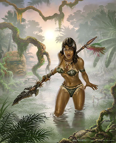 PRISTA KROSK
I had been toying with a swamp scene ever since I was in Junior High school. I liked the idea of showing a steamy jungle with a glowing amber sun in the distance and layers and layers of trees bathed in mist that gradually showed more and more detail as they came closer and closer to the foreground.
I decided to take this basic idea and add an Amazonian type female to the scene. This worked out well since I needed a piece in my portfolio at the time that showed skill with anatomy.
To make sure the anatomy correct I started with an unclothed form, and then painted in layers of clothing over top of the body, including the garments, armband, necklace, and headband. The female was painted without any visual references — except for the face.
I walked around my neighborhood and got some shots of the local palm trees which lined the streets near my home. Then I flattened the contrast in the computer and used some of these in the background.BUY PRINT
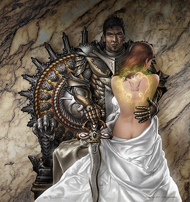 THE CURSE GIVER
My inspiration for this book cover was drawn closely from the author’s descriptions of her cover ideas. I wanted to show a dramatic contrast between the softness of the skin and dress of the girl, against the harshness of the armor of the man. For this reason I chose a white dress and pale skin for the girl, and dark, jagged armor for the man.
To achieve the lighting effect on the armor I carefully studied the effects of light and reflections on metal. I also studied a few images of armor that I found on the internet for reference material.
I did several photo shoots to get the placement of the man’s arms and hands correct and to nail the position of the light source. I wanted to achieve the appearance of a “mystical” glow, so as one of the last steps to the painting I brushed in a soft white haze across the highlight areas, such as the girl’s dress. BUY PRINT
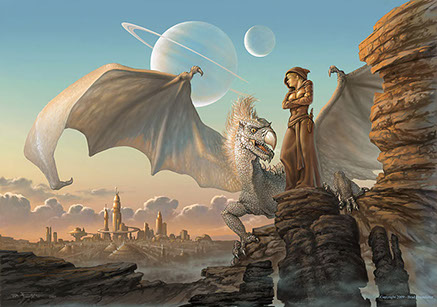 GUARDIANS OF ECTHELEOUS
This illustration was inspired by one of my hikes in Griffith Park in Los Angeles. I was hiking at dawn one morning and fortunately I had brought my camera. I had just reached a lookout point on the trail when I caught a view of the L.A. skyline. The rising sun was gleaming off the steel of the buildings and there was a bank of clouds behind the buildings with a silver lining, making for a strikingly beautiful scene.
I decided to make a painting of the scene, and would convert the skyline into a futuristic cityscape, and in the foreground I would have a white dragon.
I used the photograph as a lighting reference to paint the cityscape. The dragon and the female were first sketched out in detail, and the sketch was scanned into the computer and used as a template for the painting. I used the warm orange colors of the rising sun (at the extreme left of the painting), as the main light source, and a bluer, secondary, light source coming from the right. These were the two key light sources which I used to illuminate the characters as the painting progressed. BUY PRINT
 RENDEZVOUS AT VESPERION NEBULA
This painting was several years in the making and went through a whole series of evolutionary stages. The Star Wars film had recently come out and it gave me a renewed serge of interest in Science Fiction art. I wanted to design a space craft that was different from anything I had seen before. It took quite some thought, but I came up with some very simple outline sketches which defined the shape of the spacecraft. Later, when I was in college I took the line drawings and made them into a very detailed and shaded pencil sketch. I took the finished sketch and scanned it into the computer and then digitally colored it to give it vivid hues until I was happy with the way it looked. Finally I took the colorized pencil drawing and used it as the reference and from it painted an oil on canvas. This was the last painting that I did with traditional media before switching to digital media.BUY PRINT
Copyright © 2000 - 2023 Brad Fraunfelter except where noted for purchased artwork. Re-use of artwork displayed on this site for any purpose is prohibited unless permission is granted in writing by the artist and/or copyright holder. Please contact 323.240.5744 or use our contact form to request permission, purchase or to license artwork. Site design and maintenance by www.DesignStrategies.com.